There are a lot more articles discussing the “airborne” nature of the virus – supporting the fear and increasing social distancing. – https://www.cidrap.umn.edu/news-perspective/2020/04/study-finds-evidence-covid-19-air-hospital-surfaces
They note 4 meters (13 feet) – however a very important sentence not mentioned in much of the press is the second paragraph – “While the findings of the environmental sampling study do not indicate the amount of live virus, if any, or precisely determine the distance of aerosol transmission, the authors say that they confirm that the virus spreads in aerosols in addition to large respiratory droplets.” The efficacy of infection at 13 ft vs. 6 ft or 1 ft is not study – as we discussed before poison content is important.
This is a study done on Diamond Princess – https://www.medrxiv.org/content/10.1101/2020.04.09.20059113v1
Conclusion – “We infer that the ship central air conditioning system did not play a role, i.e. the long-range airborne route was absent in the outbreak. Most transmission appears to have occurred through close contact and fomites.” Social distancing would help reduce the odds of fomites (objects) interaction.
Do you want to go grocery shopping? I always thought the first week of grocery panic was quite irrational given one was scared of getting infected yet went right to probably the most likely place to get it. I do believe we could have been smarter here and implemented days in week for certain people with last names for designated days. One could have easily been able to guesstimate the splits by using local school data. I still think they should implement this IF we continue with quarantine. https://www.livescience.com/amp/how-coronavirus-spreads-grocery-stores.html?__twitter_impression=true
Bad news…Harvard expert (who knows what that means) says continue into 2022 perhaps into 2024 –
Unintended consequences….perhaps also supports my “SMART”quarantine concept – “The model also showed the consequences of too much isolation. A 20-week period of social and economic shutdown was so effective at reducing virus transmission “that virtually no population immunity was built”, which in turn intensified the next peak in the roller coaster of disease and death.”
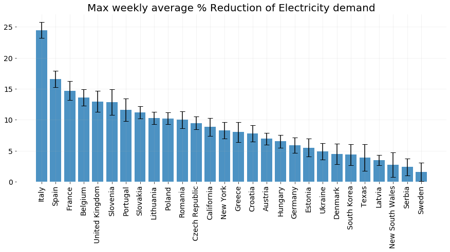
Load impact noted here in Amperon study – weekly peak load drops are quite significant – https://amperon.co/blog/covid-19-impact-on-global-energy-markets/
Cant ignore the data – perhaps noncoincidental but these countries did do a good job overall in terms of death numbers per capita – so far. Taiwan noted for the SMART quarantine approach – Iceland so far has 10% of population tested! 0.5% per capita confirmed yet death rate 0.002% – https://www.forbes.com/sites/avivahwittenbergcox/2020/04/13/what-do-countries-with-the-best-coronavirus-reponses-have-in-common-women-leaders/#910c2a13dec4
Houston chart noticed the underlying condition notation:
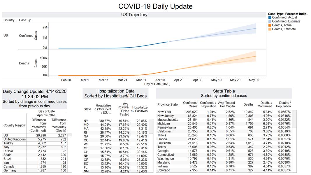
US total the daily death total beat the previous daily peak – 2227. Once again concern from weekend catch up.
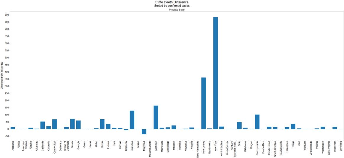
Besides workflow issues – There is also a Maryland revision. Daily data points are suspect. NJ new daily death peak. I still think they end up worse than NY in many metrics.
There are lot more states now that have tested over 1% of the population. LA just surpassed NY in terms of testing per capita.
There are certainly more hope in LA (light blue below) than in NY (orange below) given a turn in the positive/Finish tested results taking a turn (third chart below). This means they are likely testing samples that are beyond the typical symptom. They are also flattening out at 0.5% of the population being confirmed. Deaths are not as exponential as NY.
India is rapidly rising. Looks like UK might be at the top on the 7 day moving avg daily death basis.


