Interesting stats….on a county basis
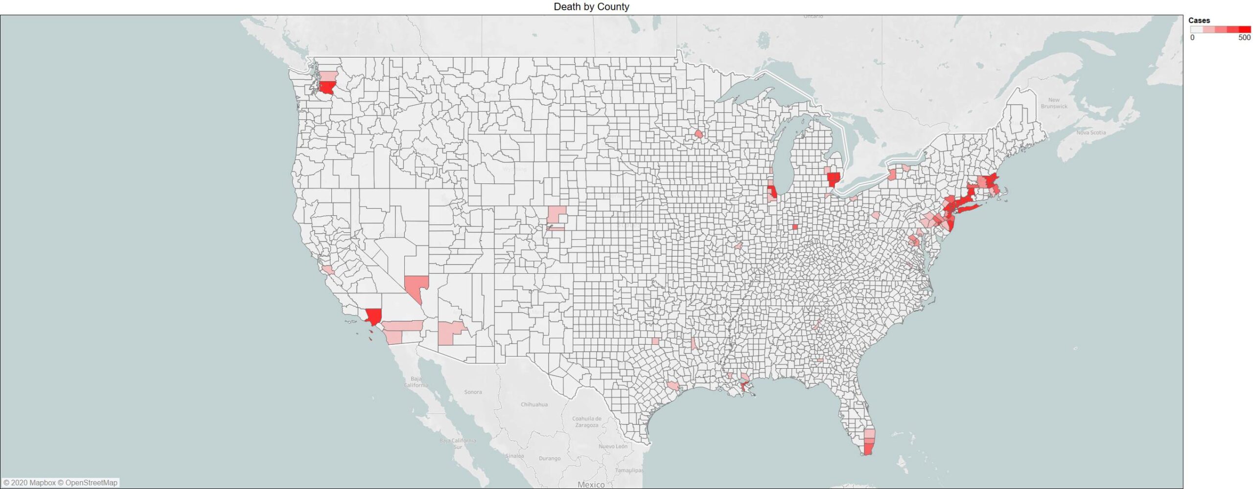
90% of covid deaths in the US represent:
7% of total counties in the US (223 counties vs. 3255)
49% of total population of the US
8% of the total land mass of the US
Clearly population density means something – perhaps this promotes suburbia and telecommuting. A good proportion of the country is not impacted.
500 death is the max red in order to even show anything on the figure below – slight pink is essentially 100 deaths – in some parts we underwhelmed the healthsystem – hard to find the right balance for sure but with technology we should be able to do better. Given the paper from Korea yesterday it would suggest the hot spots within the county are probably even more focused. We should be taking the test data and building a more pinpoint mapping of the virus. Certainly testing is behind in several states so this may be quite an incomplete picture but you really don’t have to test that much to get a good view of what is going on.
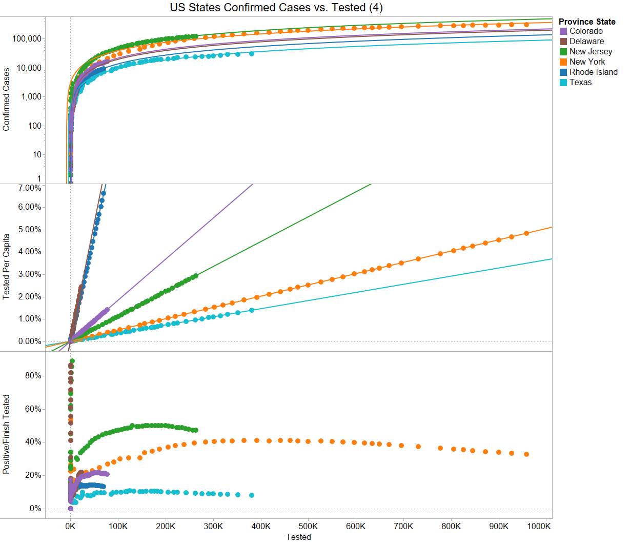
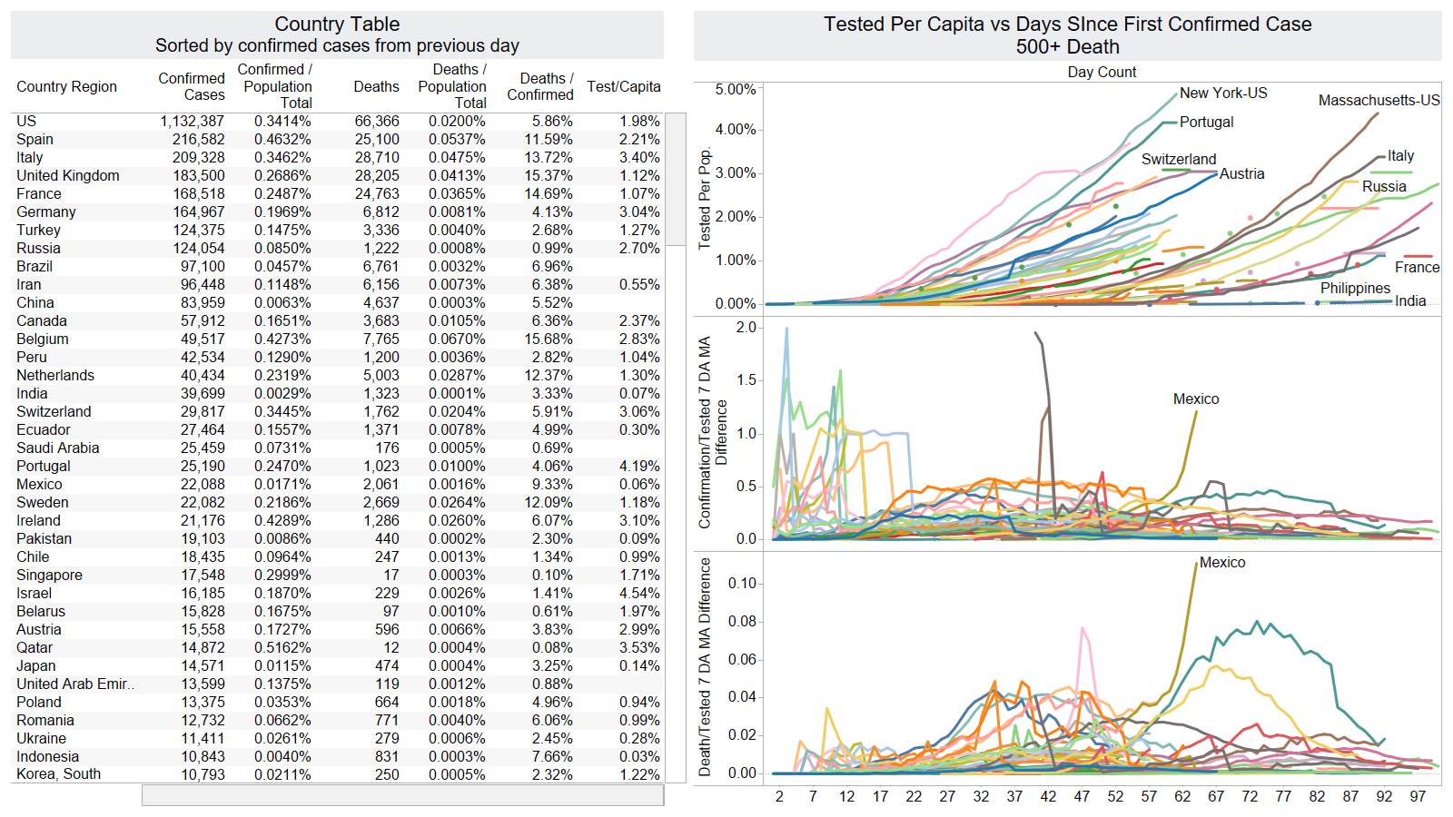
You can see once you test around 0.5% to 1% you can build an equation to calculate the amount of confirmed case as you test more and it has been generally accurate. NY is prime example now NJ – for a lower level of infection – TX continued testing but it is not changing the trajectory.
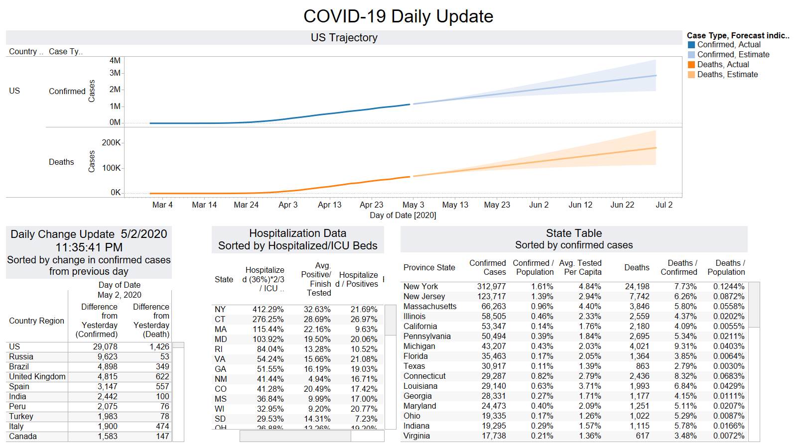
Lower death day typical for Sunday reporting
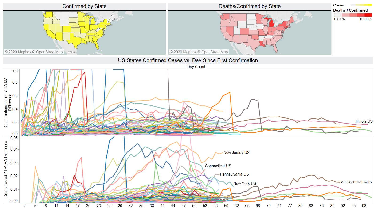
NJ CT PA show death uptick on 7day MA
US has now tested almost 2% per capita. I suspect something is off in Mexico.
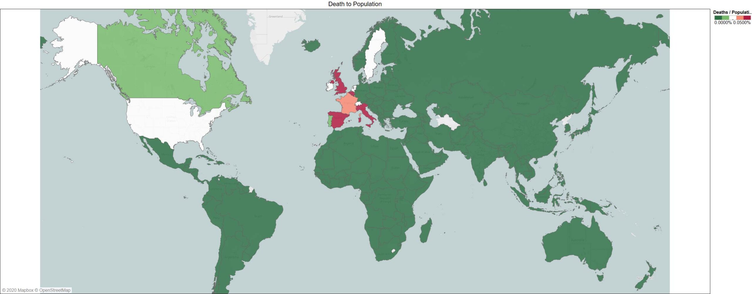
World view to see that Sweden does stick out from their neighbors – but not significantly – just slightly higher than the US on death per capita (0.026%)
