It is May – lets see if we can look at the data differently to get a better perspective on where we came from in April.
In theory if one kept on testing (which in general everyone did) eventually at some point you move away from the obvious infected people to the less obvious and your testing confirmation and deaths should naturally fall.
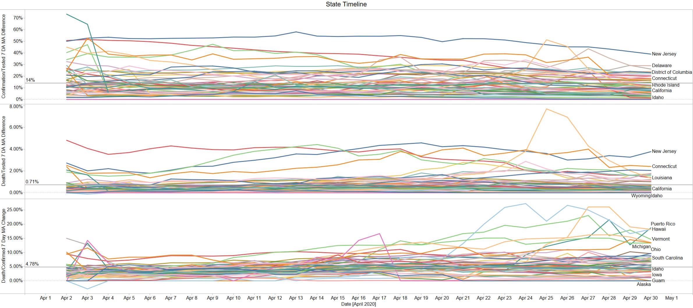
The good thing we see this across most major states. The below chart represents the 7 day moving average of the daily difference in the categories noted. Using a 7 day in theory help gets rid of the social behavior of not reporting consistently over weekdays vs. weekend and any data blip that occur that eventually get corrected but perhaps not back corrected in time. The 7 Day Average view does make you lose sight of anything that might occur this week but I don’t think we should necessarily respond per daily change given the errors noted above. At the same time this view is just the change so its not bias to the history – so it represents the recent testing batch.
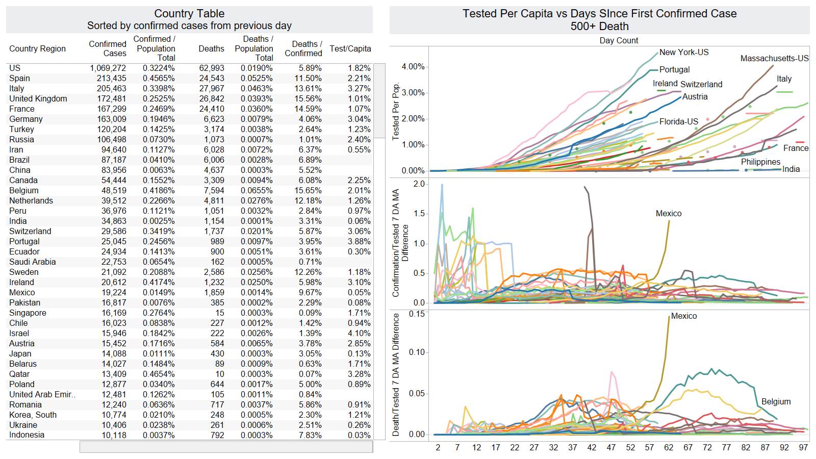
The top blue line NJ and the top red line before crashing into the see of other states is NY. 7 day MA change of confirmed / 7 day MA change of tested is the first plot. This gives an indication of when you test how many have Covid-19 in their system. This gives you a clue on how pervasive the virus is in society. Obviously this metric is dependent on the method of testing. If you only test symptomatic patients it will be high odds its positive. In the beginning of April NY testing was coming out at 50% then by the end of the month 20%. The average of the timeline is coincidently near the weighted average on April 30th based on test by state of 13%. Studies have indicated that general population likely infected 4-8% already. This does support that number. Washington who was ground zero for US is testing still at 10%. Strategy should change as a function of how many you believe are already infected.
The second graph gives an indication of death/tested. In theory on a long enough timeline everyone gets tested and you obtain the crude death rate so this gives a clue to that figure. NY started at 4.8% and now is 1.4%. The average weighted on April 30th is 0.9%.
The third graph is the most common metric discuss when talking about death (crude death rate likely more accurate for historical comparisons). As noted in other discussion the death/confirmation is tied to the confirmation which in the beginning is changing so much as you start testing the sick and expand. NY mortality rate started the month at 9.5% and is now at 6.95%. So in the beginning IF you were confirmed with covid-19 in NY you would have a 9.5% chance of dying vs. now its 6.95%. This number will continue to fall as more and more are confirmed as more testing is done as indicated by the first metric.
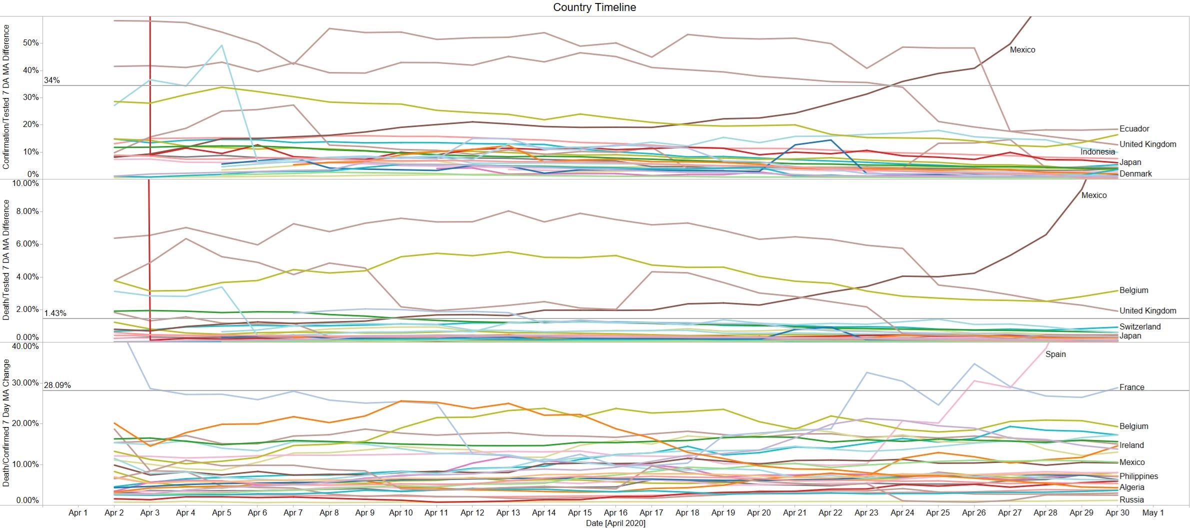
Looking at this on the same global view ex US – we see a lot more volatile data as different countries are at different stages and also the data inconsistency is apparent. Testing data from various countries seemed to be delayed.
The UK was testing confirming 42% in the beginning now only 13%. UK death per tested dropped from 6.4% to 1.9% with mortality rate staying the same at around 16%. Italy dropped from 12% to 4%. Italy death per tested dropped from 1.9% to 0.6%. The mortality rate for Italy unfortunately has been staying around 15.5%.
A lot of the countries are bunching up around 3-5% confirmed per test . Death per test all point to sub 1% on a long enough timeline. Mortality rate more of a function of the countries issues and doesn’t seem to trend to bunch down overtime.
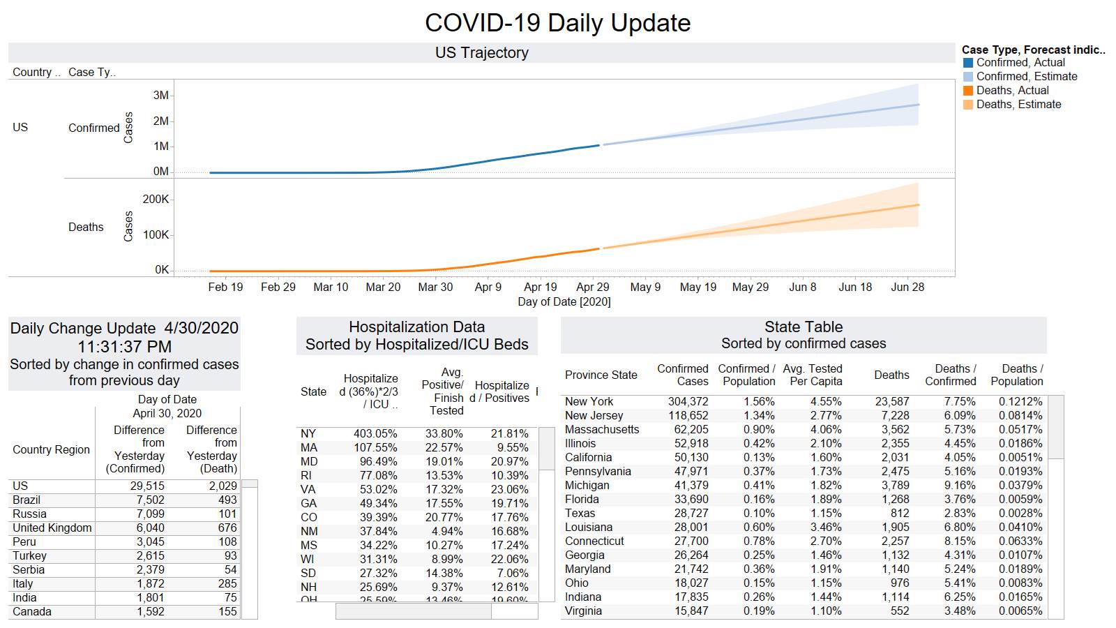
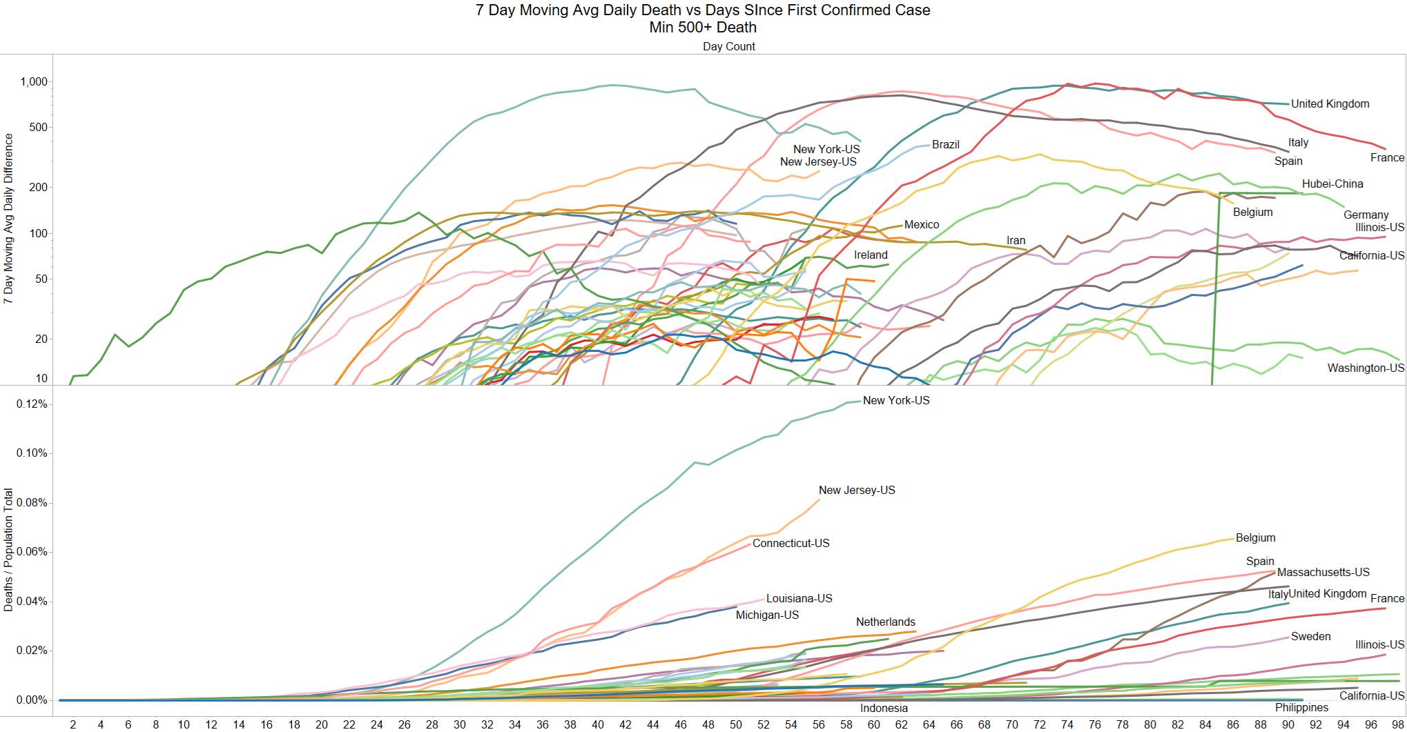
The craziness in the UK disappeared. The US is back on top in daily deaths. This time NJ is in the lead with 457 deaths. Very concern given how much an outlier NY is now whether some of those deaths are over reported whereas other places are more epidemiology reported so we can actually learn and understand the impact. IF reporting any death infected from covid this will not give a very good representation of what is actually going on. However one should be able to see this if you graphed deaths from other diseases on a timeline with last yr, 5 yr avg, vs this year by different major cause of death buckets. I don’t have the data to do this.
NJ is a concern as noted several times.
Mexico is somewhat a data issue but there are underlying concerns. Belgium looks to be creating a mini – second wave.
Looks like Brazil might be hitting a plateau. Todays chart looks good overall with many countries showing declines the daily death change and several pausing their climb in deaths.
